Manuscript Formatting
 I have been asked a number of times about manuscript preparation for publishing by Energion. The bottom line is that we accept manuscripts in almost any word processing or text format, including Microsoft Word, OpenOffice.org Open Document Format, or even RTF.
Formatting your manuscript is part of what we do as publishers. Nonetheless, there are some guidelines you can follow in order to make the publication process easier and help us ensure that errors don’t creep into the final product. So if you want to smooth the process, here are some guidelines.
Our preferred file format is OpenOffice.org Open Document Format, though Microsoft Word™ is a very close second. OpenOffice.org is open source, and is available for download free, though a donation to the project is suggested. You can submit manuscripts in almost any text format, though PDF is not acceptable. Other than a couple of times when someone tried to hand me hand written pages, I have yet to receive a document that was completely unacceptable.
More important than file format, however, is the way that you apply formatting to your document. For the remainder of this post I will assume you’re using either OpenOffice or Microsoft Office. Everything I indicate here is possible with either one.
The following things should be avoided:
- Overuse or misuse of the spacebar. The spacebar should be used for just one purpose–putting a single space between words. It should still be a single space following punctuation, including a period, question mark, exclamation point, or colon. In fact, if you are hitting the spacebar more than once for any purpose in your document, you’re making the job of page layout harder. We have to use search/replace to get rid of the extra spaces, and the incredible number of possible combinations makes constructing a good search interesting. In particular, do not put any spaces at the beginning or end of a paragraph. Don’t combine a space with any non-printing characters. Also, leave non-breaking spaces to us unless we agree ahead of time precisely where the are to be placed. A good example is between the book name and chapter number in a scripture reference. The problem here is that often these are settled on a case by case basis.Further never position items with the space bar, such as centering or creating columns. Such text positioning won’t survive reformatting. Don’t use the space bar to split URLs or other long items in order to improve justification. In fact, you don’t really need your document justified when submitted in any case.
- Lay off the tab key. Don’t use a tab to indent paragraphs or to position columns unless you specifically set tabs. If you put tab stops in your style, they will convert into our page layout software with little trouble, but the default tabs will not. (See below regarding use of styles for more information.)
- Limit use of the Enter or Return key. The enter key should be used to end a paragraph or a heading. It can be used to position a line on a title page, though we’ll replace that formatting when we do the layout. Don’t use it do add extra spacing between headings and text, or to provide extra space between paragraphs. Again, see below on the use of styles.Use a hard page break to move text to the next page rather than hitting the enter key until a new page comes up.
- As a general rule don’t change fonts, font sizes, or text styles manually in a paragraph. Use a style for the paragraph that has all these things right.
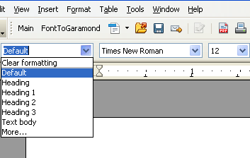
So, you may ask, how do we do these things? The answer is the same for both OpenOffice Writer and Microsoft Word–styles. Create a style for chapter titles, each heading level you want to use, for paragraphs, and for quotations. If you have additional text at the beginning of a chapter, for example, create a style for each type.
For example, if you have chapter headers that have a number on one line followed by a chapter title, a chapter subtitle, and then a scripture, you should have a style for each one, including fonts, centering, spacing above and below, and style (bold or italics).
If you have headings, subheadings, and sub-subheadings, each should have a style. I prefer the names Heading 1, Heading 2, and Heading 3, etc., but just so long as you are consistent document conversion is easy.
 Just because two headings look the same doesn’t mean they are equally easy to work with. If you modify your Heading 1 style so it use Book Antiqua, bold, 16pt text, but in another case you just set the font, size, and style after selecting the text, the two will look the same, but one will give us trouble on conversion.
You can change portions of text to add bold, italics, superscript, or similar styles, but don’t do this with a whole paragraph or a whole heading. We also suggest you don’t do font changes within a paragraph.
Other Issues
Don’t worry about headers or footers. We can handle that later.
We don’t need 1 1/2 or double spaced manuscripts.
You can insert images, but we will ask for the source files, so keep them and send them separately from your manuscript.
All images must be at least 300 dpi. Be sure to check both the size of the image and the resolution. An image might be 600 dpi, but be 300×300 pixels, which would mean it was 1/2″ x 1/2″. I could size such an image to 1″ x 1″ which would make it 300 dpi, but I could not make it any larger than that.
Conclusion
Note again that most of these items are suggestions, not requirements. It helps us if you do this. In fact, if you follow all these guidelines, I can transfer your manuscript to page layout with hardly a keystroke.
